 Skip to content
What Makes Embroidery on a Patch Look Premium?
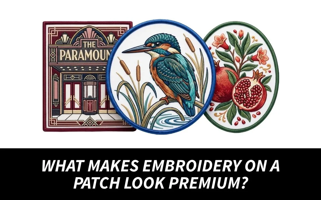
Even if you do not have any embroidery knowledge, you will realize that quality custom patches look good. The surface looks cleaner, the design feels more organized, and even the small details look well placed. When you understand patches embroidery, you can also see how stitching quality contributes to the overall appearance.
The idea about a premium patch rarely depends on one feature. The high-quality patch is a result of numerous visual choices working in harmony.
When it comes to ordering custom patches, knowing the importance of the features above will help you check the samples and avoid getting the patches that look great on photos, but not as impressive in reality.

Stitch Direction in Custom Patches Can Change the Whole Look
One thing that people tend to forget is the direction of the stitch.
Embroidery is not just about filling space with lines randomly. The direction of the stitch can be following a curve, a shape, the lettering, and other elements in the art. For example, if you have a leaf in your embroidery project.
If the stitches follow the way that the leaf is made, then it will give you a more refined look. If you put the stitches through each section in the same way, then the leaf will have a less defined look.
This is true of letters, waves, feathers, flames, and curved logos.
Smooth Transitions Make Embroidery Feel Refined
Consider places where colors meet.
Good custom patches should have smooth transitions that look natural and well planned.
The separation of colors should aid the overall picture rather than interfere with gaps, rough edges, or uneven patches.
This is particularly true of small logos in patches embroidery.
For instance, consider a round logo featuring a dark edge bordering a lighter center picture. A change in the width of the dark edge can leave an otherwise perfect patch with an amateurish look.
The reason for consistency is that the human eye easily picks out any irregular pattern.
The Surface Should Have Controlled Texture
When there is too much thread gathered in one place, the effect can become chunky. When there is not enough material covering the surface, the base fabric will be visible where it shouldn’t.
It is the latter that is the better option through texture control.
Certain areas can be flat while others are in focus. A raised border around an image or logo, for instance, creates depth without making the overall piece bulky.
This makes it easier for the eye to find a point of focus in patches embroidery.
Negative Space Can Make a Patch Look More Expensive
Consider a patch having a company name and an icon.
If the lettering almost touches the icon, the border, and the outer edge, the design can feel cramped. Increasing the spacing slightly may make the same artwork appear much cleaner without changing the logo itself.
This is particularly important when working with small custom patches because a few millimeters can greatly affect how separate elements appear.
Empty space is not wasted space.
It helps important details stand apart.
Small Details Should Look Deliberate
Any tiny star, line, outline, or letter could be used as the characteristic element of custom patches if there is enough space left for it.
This is the reason why skilled patch designers often make their artwork simpler during the process of patch creation.
They are not taking away any character.
They are preserving what really matters.
Lettering Is One of the Fastest Quality Checks
Pay attention to the space in the letters rather than the overall word.
- Are letters clearly visible?
- Are letters with curves still in their original shape?
- Are thin strokes still visible?
- Does the text follow the intended curve without being stretched?
These questions become especially important with small custom patches that contain names, locations, initials, or short phrases.
The Patch Should Look Good From More Than One Distance
An excellent patch must work well both when viewed up-close and at regular distance.
When viewed up-close, there must be neat stitching and controlled details.
When viewed from a few feet, there must be an organized overall design and not a hodge-podge of lines.
This is important because patches are almost never displayed on a table for people to view. They end up being worn on jackets, uniforms, hats, bags, and backpacks where other people will see them as they walk past.
Here is a simple test you can do on any design before approving it:
View the patch up-close and then take a few steps back without altering the lighting. If the design disintegrates into chaos, it may have too much detail for its size.
Color Matching Also Affects the Premium Feel
Not only does color play a role in making a patch appealing but it also plays a role in making sure that all the parts of a design work together and create a feeling of unity.
Generally, a good patch will always keep its primary colors distinct from each other while at the same time avoiding excessive visual distractions.
The colors in the patch design must also be represented by the thread faithfully. When it comes to branded patches, this takes on even greater importance as the embroidered patch must retain its identity.
This is not to say that every color from the computer will be reproduced accurately through embroidery.
As embroidery uses physical media, designers must view a physical sample or production proof for accuracy in cases where exact color is required.
The Back Should Not Ruin the Front
While a custom patch may feature stunning embroidery at the front, it can still appear poorly made when flipped around.
The back of the patch must be neat enough for the purpose and must involve no loose threads or mistakes in finishing that would interfere with attaching and wearing the product.
The right type of back also depends on the practical purpose of the patch.
A patch that has to be placed on a uniform permanently needs a different back than a patch that a person wishes to move from one jacket or bag to another one.
Thus, high quality means practical quality along with the aesthetic one in patches embroidery.

Premium Is More About Control Than Decoration
The best custom embroidered patches are not those that contain the greatest amount of thread or colors or have the most complex design.
When you look closely at the most professional patches, it becomes evident that every part creates an impression of order.
The thread follows the design clearly and does not crowd the essential elements. Textures are created without fabric bunching up. The text on the custom patches is easy to read. The colors combine well making the final product look harmonious.
So when judging the quality of custom embroidered patches, pay attention to how each stitch plays its part and not just to the number of colors used.