 Skip to content
What Makes a Custom Lapel Pin Look Expensive
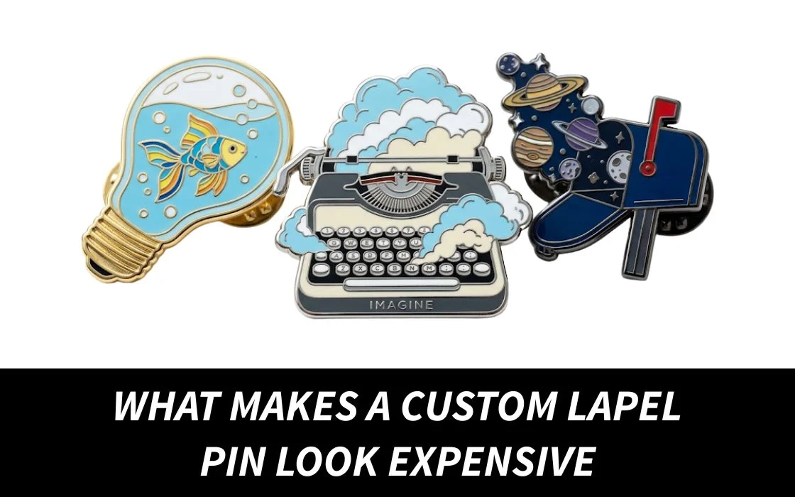
There’s something funny about lapel pins.
People assume they’re simple. Small piece of metal, add a design, done.
But then you put two pins side by side and suddenly the difference feels obvious.
One looks polished. Premium. Like something someone would actually keep and wear again.
The other looks… fine. Not terrible. Just forgettable.
And most of the time, that difference isn’t because one cost dramatically more.
It usually comes down to details.
The kind people skip because they don’t seem important at first.
Things like finish, proportions, spacing, texture, weight. Small choices that quietly change how the final pin feels in someone’s hand.
That’s what makes a custom lapel pin look expensive.
Not the price tag.
Expensive-Looking Pins Usually Feel More Controlled
One of the biggest mistakes people make is trying to make the pin do too much.
More text. More icons. More colors. More effects.
The thinking makes sense… if you’re paying for customization, why not use all of it?
But that’s usually where things start going wrong.
Premium-looking lapel pins tend to feel more intentional. There’s one idea leading the design instead of five competing for attention.
You’ll notice this with luxury branding too. Clean layouts. Strong shapes. Space that feels deliberate.
A good pin doesn’t need to explain itself immediately.
It just looks put together.
That doesn’t mean boring or minimal.
It means every element feels like it earned its place.

The Metal Finish Changes More Than You Think
People spend hours deciding colors and forget the metal entirely.
But metal finish quietly changes the entire mood of a pin.
A soft gold finish instantly feels warmer and more classic. Silver tends to look cleaner and more formal. Black metal usually feels more modern and slightly premium when paired with simpler designs.
What’s interesting is that the exact same artwork can feel completely different depending on the finish.
That’s why random choices don’t usually work.
The finish should support the style of the pin instead of trying to stand out on its own.
If you’re planning something custom, exploring different custom lapel pins before finalizing can completely change the outcome.
Weight Creates Quality Before People Even Notice It
This part sounds small but it’s real.
People judge quality with their hands almost instantly. A pin doesn’t need to be heavy.
But if it feels too light, too thin, too empty… people notice.
That slightly solid feeling gives the impression that care went into the product. It creates confidence.
You see this with watches, packaging, phones. Pins work the same way.
That extra bit of structure doesn’t scream premium.
It quietly suggests it.
Color Choices Matter More Than Quantity
A lot of people think expensive means colorful.
Usually not.
Too many colors can make a pin feel crowded and harder to process. The designs that feel expensive often use fewer colors but use them intentionally.
A strong contrast. A muted palette. A focused combination.
That creates visual confidence.
And confidence always feels more premium than trying to impress people with everything at once.
This doesn’t mean every pin needs to be black and gold.
It just means colors should work together instead of competing.
Detail Helps… Until It Starts Hurting
There’s a line.
Enough detail makes a pin feel thoughtful.
Too much detail makes it feel messy. That line is different for every design, but the principle stays the same.
People don’t experience lapel pins the way they experience screens.
Nobody zooms in. So tiny details that looked impressive digitally sometimes disappear completely in production.
That’s why simplifying usually improves the final result.
Not because less is better. Because clearer is better.
Clean Edges Quietly Make a Huge Difference
This one gets ignored constantly.
People look at the front design and forget the edges.
But edges tell people a lot.
Smooth borders. Consistent outlines. Sharp finishing.
That’s what makes something feel complete.
Rough edges or uneven shaping instantly lower the perceived quality… even if the artwork itself is strong.
Most people won’t explain why they think one pin looks better.
They’ll just feel it.
Size and Proportion Matter More Than Bigger or Smaller
There’s a common idea that bigger automatically feels premium.
Not really.
A lapel pin should feel balanced.
Too large and it starts feeling awkward. Too small and details disappear.
The expensive look usually sits somewhere in the middle.
Enough size to show detail.
Enough restraint to still feel wearable.
That balance matters more than people expect.
Texture Adds More Character Than Extra Design
Texture is underrated.
Raised metal sections. Smooth enamel. Matte finishes.
Those little variations create depth.
And depth creates interest.
People tend to associate texture with craftsmanship because it feels more intentional than flat surfaces.
It doesn’t need to be dramatic.
Just enough to make the pin feel like an object instead of a printed shape.
If you’re creating something meant to feel polished and long-lasting, you can explore custom lapel pin options here and focus on details that improve how the pin actually feels… not just how it looks online.

Packaging Quietly Influences Perception Too
This isn’t technically part of the pin.
But it changes how people experience it.
Even a great pin can lose impact if presentation feels rushed.
A simple backing card. Clean packaging. Thoughtful presentation.
Those details create context.
And context affects value more than people think.
Sometimes people judge the experience before they even touch the product.
Good Quality Feels Effortless
The interesting thing about premium-looking lapel pins is that they don’t try to prove they’re premium.
They don’t overload details.
They don’t scream for attention.
They just feel finished.
That’s usually the difference.
Everything works together.
Nothing feels accidental.
If you want that polished result from the start, you can create custom lapel pins with Quality Patches and focus on the details that make people keep them instead of tossing them into a drawer.
Wrap up!
Expensive-looking custom lapel pins usually aren’t about spending more.
They’re about making smarter choices.
Better balance. Better finishes. Better materials. Better restraint. And when all of that comes together, people notice. Not because the pin is flashy.
But because it feels right. That’s usually what quality looks like.