
What Goes Into a Strong Fire Department Patch
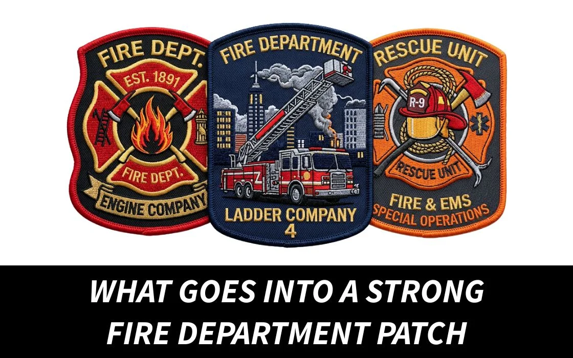
At a glance, it looks simple.
A patch on a uniform. A logo, some text, maybe a symbol or two. That’s it, right?
Not really.
Because if you’ve ever looked closely, some fire department patches just feel right. They look solid. Balanced. Like they belong exactly where they are.
Others… look okay. But something feels off. Hard to explain, but you notice it.
And that difference doesn’t come from design alone.
A strong fire department patch is built on a mix of things… purpose, material, structure, meaning. Miss a few of those, and even a good design won’t carry the same weight.
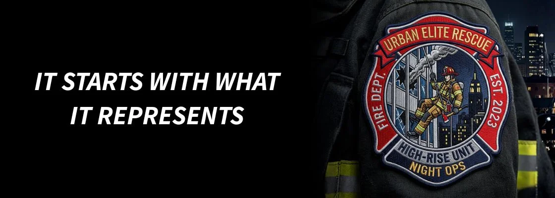
It Starts With What It Represents
Before anything else, a patch needs to stand for something.
Fire department patches aren’t just decoration. They represent a unit, a station, a team. Sometimes even history.
That’s why they feel different from regular patches.
So the starting point isn’t “what looks good?” It’s “what does this patch stand for?”
That answer shapes everything that comes after… the symbols, the layout, even the colors.
Without that meaning, the patch might look clean… but it won’t feel strong.
Design Needs to Be Clear, Not Complicated
A lot of people think more detail = better patch.
It usually doesn’t.
Fire department patches are meant to be seen quickly. From a distance. In real environments, not just up close.
So clarity matters more than complexity.
Strong shapes. Readable text. Symbols that make sense instantly.
If someone has to stare at it to understand it, the design isn’t doing its job.
Simple doesn’t mean basic. It means intentional.
Structure and Layout Make a Big Difference
This is where things get subtle.
A patch can have all the right elements, but if they’re not placed properly, it feels off.
Spacing matters. Balance matters.
Where the text sits. How the emblem is centered. How everything flows together.
Good patches feel organized without looking rigid. Nothing feels crowded, nothing feels empty.
It’s one of those things people don’t always notice consciously… but they feel it right away.
Material Choice Affects the Entire Look
Not all patches give the same feel.
And for fire department use, that choice matters more.
Embroidered patches are the most common. They’ve got that traditional, textured look people expect. They feel authentic.
PVC patches are more modern. Cleaner edges, more durable, better for harsh conditions.
Both can work… it just depends on what you’re aiming for.
If you’re not sure what fits best, it helps to explore custom patches that match both your style and your use instead of going with whatever is easiest.
Durability Isn’t Optional Here
This isn’t casual merch.
Fire department patches go through real use. Movement, weather, washing, daily wear.
So yeah, they need to hold up.
A strong patch keeps its shape. The stitching stays tight. Colors don’t fade quickly. Edges don’t start falling apart.
Cheap materials show fast.
And once that happens, the patch doesn’t just wear out… it loses that sense of reliability.
Color Has a Purpose
Fire department patches usually follow certain color patterns for a reason.
Not just for looks.
Contrast matters. Visibility matters. Tradition plays a role too.
Bold combinations like red, gold, black… they’re common because they stand out clearly and carry meaning.
Going too experimental can make a patch feel disconnected.
So it’s not about limiting creativity. It’s about making sure the colors actually work in context.
Backing Should Match Real Use
This part gets overlooked more than it should.
How the patch attaches matters just as much as how it looks.
Sew-on patches are the most secure. They stay in place long-term.
Velcro is more flexible. Easy to remove, easy to switch.
Iron-on? Not ideal for heavy-duty use.
So again, it comes back to purpose. A strong patch isn’t just designed well… it’s built to function properly too.
If you’re planning something practical, you can create custom patches here with the right backing so they actually work in real conditions.
Stitching and Finishing Show the Real Quality
You can tell a lot just by looking closely.
Good patches have clean stitching. No loose threads. Edges are smooth. Everything feels tight and controlled.
Bad ones feel uneven. Rough. Like corners were cut.
And that difference changes how the patch is perceived instantly.
Even someone who doesn’t know anything about patches can feel when something is off.
It Should Feel Like It Belongs
This is hard to explain, but it’s real.
A strong fire department patch doesn’t feel added on.
It feels like it belongs exactly where it is.
On the uniform. On the gear. Part of the identity.
That only happens when everything lines up… design, material, size, color.
When something is off, it stands out. When everything works, it just feels natural.
Tradition Still Matters
Fire department patches carry a sense of tradition.
Even when designs evolve, that foundation stays.
Trying to make something too modern or too different can sometimes take away from that.
It’s about balance.
Respecting the traditional elements while still making the patch feel current.
That’s where the strongest designs usually land.

The Right Manufacturer Makes a Difference
You can plan everything right.
But execution still matters.
A good manufacturer won’t just produce what you send. They’ll guide you… adjust details, improve layout, suggest better options.
That’s how you avoid common mistakes.
If you want to get it right the first time, you can get high-quality custom patches made here and make sure everything comes together the way it should.
So… What Makes It Strong?
It’s not just one thing.
It’s everything working together:
A clear purpose.
A design that’s easy to read.
Strong structure and layout.
The right material.
Durability that holds up.
Clean stitching.
Meaning behind it.
Take one or two away, and the patch might still work.
But when all of it comes together… that’s when it feels solid.
Wrap up!
A strong fire department patch isn’t just something you see.
It’s something you recognize.
It carries identity. It holds up over time. It fits exactly where it’s meant to be.
And most of that comes from the details people don’t think about at the start.
So if you’re creating one, don’t just focus on the design.
Think about the whole picture.
Because that’s what makes the difference between something that looks okay… and something that actually feels right.
FAQs
What is the best material for fire department patches?
Embroidered patches are the most common because they offer a traditional look. PVC can be used for more durability in tough conditions.
How long do fire department patches last?
With good quality, they can last for years even with regular use and washing.
Are Velcro patches used in fire departments?
Sometimes, but sew-on patches are more common for uniforms since they’re more secure.
What size should a fire department patch be?
Most patches are between 3 to 4 inches, depending on placement and design.
Can fire department patches be customized?
Yes, they can be fully customized with logos, text, and symbols that represent the department.
Do colors have specific meanings?
Often, yes. Many departments follow traditional color schemes that represent strength, service, and visibility.
Where can I get fire department patches made?
Look for a provider that focuses on quality and detail. Quality Patches is a solid option if you want patches that actually hold up and look right.