 Skip to content
 Essential Tips to Design Patches for High-Quality
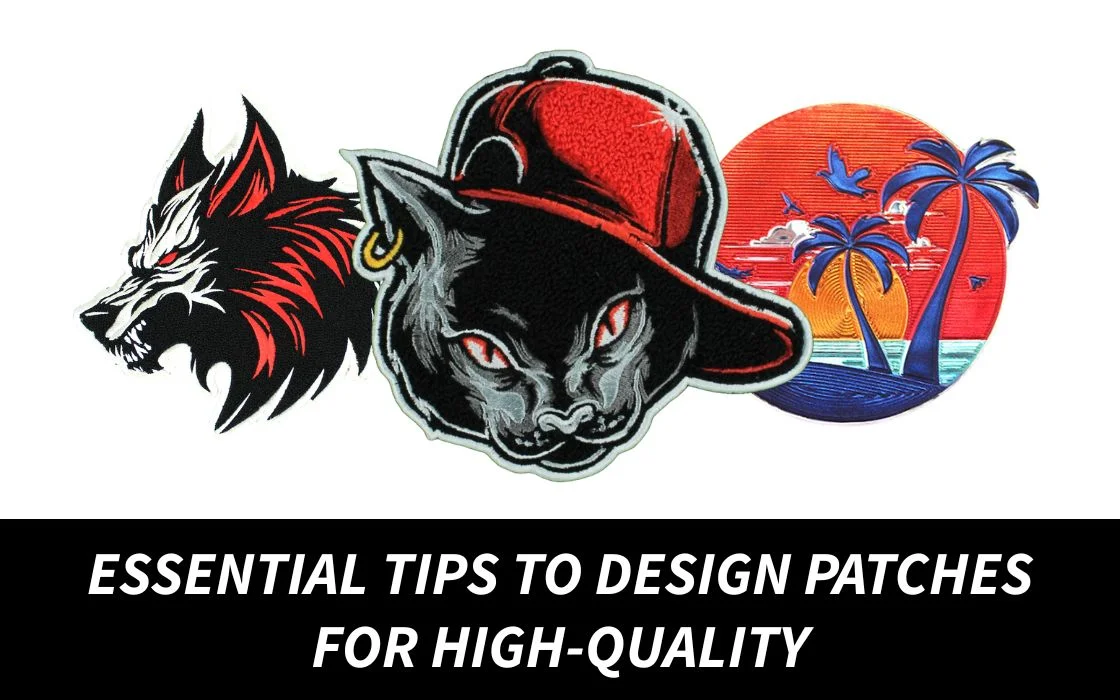
When you’re creating a patch, whether for branding, uniforms, events, clubs, merch, or personal expression, the way you design patches ultimately determines how they look, feel, and last. A patch may seem small. But every element matters: colors, borders, text size, shape, stitching, and material choice. If even one detail is off, the final product can appear cluttered, unreadable, or low quality.
We can help you get flawless results. Here are the most essential, professional design tips. It ensures your patches turn out clean, bold, and highly readable.
1. Start With a Clear Purpose Before You Design Patches
Before you open any design software or send a sketch, ask yourself:
- What is the patch being used for?
- Who will wear it?
- How visible should it be?
- What message must it communicate instantly?
The design of patches depends on the purpose: it is either bigger or smaller, with a particular color palette, specific font, shape, and even the material. A patch as worn in the military should be seen, not felt, and a patch on a fashion shirt may be felt.
If you’re unsure which direction to take, you can always get design guidance from the experts at Quality Patches. They help refine patch concepts into clean, production-ready art.
2. Keep Text Bold, Simple & Readable
The most common mistakes made by people when they design patches would be placing excessive text or using a slim decorative font. Embroidery threads are physically thick, and hence minute details may be lost.
Best text rules for patch clarity:
- Stick to bold, sans-serif fonts.
- Make sure letters are at least ¼ inch tall.
- Avoid long phrases (less is more).
- Keep spacing wide so the text doesn’t blur together.
Text should be readable, whether one is 2 feet or 20 feet away.

3. Choose High-Contrast Colors for Maximum Visibility
The trick of crisp and eye-catching patches is color contrast. When you design patches, the background and foreground color should not blend with each other, but complement each other.
Good contrast examples:
- Black background + white or gold text
- Red background + yellow borders
- Navy background + white details
Poor contrast example:
- Dark green background + black text (nearly invisible)
Your patch should be readable at a quick glance. High contrast ensures that.
4. Pick the Right Shape to Match Your Message
The shape you choose when you design patches affects the overall feel and balance.
Common shapes and their vibes:
- Circle patches: Perfect for logos and symbols
- Shield patches: Great for uniforms and security teams
- Rectangle patches: Best for name tags and text-heavy designs
- Custom die-cut shapes: Modern, fun, great for merch drops
A shape should enhance your visuals, not restrict them.
5. Use Thick Borders to Hold Everything Together
A clean border is one of the most defining traits of a high-quality patch. When you design patches, borders serve two critical purposes:
- They frame the design.
- They keep the threads tight and prevent fraying.
Merrowed borders (rounded, raised edges) work well on standard shapes, while heat-cut borders are best for custom shapes.
For perfect edges on any shape, work with professionals who specialize in finishing details. Quality Patches ensures clean borders on every custom patch order.
6. Avoid Overly Tiny Details, Keep Artwork Bold
Small lines, fine textures, tiny icons, and miniature trademark symbols don’t translate well into thread. Even woven patches and PVC patches have limits.
When you design patches, simplify your artwork by:
- Using thick lines
- Removing extra details
- Emphasizing strong shapes
- Making icons and logos bold
This assists in ensuring there is visual balance and the patch will not be messy or pixelated.
7. Select the Material That Fits Your Design
Different patch materials affect how your final design appears.
Here’s how materials influence your design:
- Embroidered patches: Ideal with classic designs, textured designs, and bold designs.
- Woven patches: Woven patches are the best for working on detailed artwork and thin lines.
- PVC patches: PVC is the most durable, has a 3D appearance, and can be used outdoors.
- Leather patches: Ideal when it comes to minimal branding on clothes, high-end.
When you design patches, you may foul up your work by selecting the wrong type of material. The correct patch type should always be compared to the design style.
8. Don’t Forget the Backing, It Affects Use & Appearance
The backing is not just functional; it affects how your patch sits on clothing.
Common backings include:
- Iron-on
- Velcro
- Adhesive
- Sew-on
- Magnetic
If you know how the patch will be worn, you can design patches more effectively by preparing for that backing from the start.
Need help choosing the right backing for durability and convenience? Quality Patches offers expert advice and full patch customization options.

9. Use Proper Scaling, Design Patches That Fit Their Placement
The patch has to be of the same size as the place where it is going to be added.. For example:
- Chest patches: 3–4 inches
- Sleeve patches: 2–2.5 inches
- Hat patches: 1.5–2 inches
- Backpack patches: 3–5 inches
Designing for the wrong size can affect readability and proportions. Always scale your design to real-world placement.
10. Request a Digital Mockup Before Production
What might appear excellent on your screen may not be balanced when you sew it. Always examine a digital mockup to verify:
- Text spacing
- Color selections
- Center alignment
- Border thickness
- Overall proportions
Mockups are essential when you design patches, ensuring no unpleasant surprises during production.
Want a free mockup before ordering? Quality Patches provides complimentary digital proofs so you can approve your design with confidence.
Bottom Line
Designing a high-quality patch isn’t just about creativity. It’s about balance, visibility and understanding how materials translate into the final look. When you design patches with clear intent, high contrast, clean borders, bold fonts and scaled proportions, your patches become not just accessories but powerful branding tools.
If you implement these essential tips, your patches will always come out crisp. They are readable, and ready to make an impact.